Running News Daily
Running News Daily is edited by Bob Anderson and team. Send your news items to bob@mybestruns.com Advertising opportunities available.
Index to Daily Posts · Sign Up For Updates · Run The World Feed
Boston Marathon's logo refresh leaves some unhappy
Back in 1890, the Boston Athletic Association chose the mythical unicorn to be its symbol. Later named Spike, that unicorn saw several redesigns in the ensuing century, before eventually finding its way to prominent placement on the Boston Marathon medal. For years, Spike faced leftward, its horn jutting into the banner type of Boston Athletic Association (B.A.A.). Then in early June, Spike changed course.
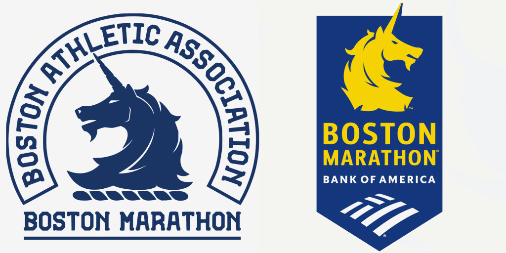
The B.A.A. unveiled a new logo for the Boston Marathon, and people are not happy about it.
On its face, the redesign is small: Spike’s orientation is flipped, and he’s made a bit more menacing. The marathon logo, along with the new Spike, sports a fresh Bank of America sponsorship tag. Despite the small tweaks, the community response has been staggering: a recent Boston.com reader poll found 55% not liking the new logo, compared to just 14% loving it and 32% expressing indifference.

Why the backlash? The B.A.A. proves just how hard it is to stay fresh (and funded) while maintaining a sprawling, legacy-minded audience. Change, for some proud marathoners, is hard.
SMALL CHANGES, BIG REACTIONS

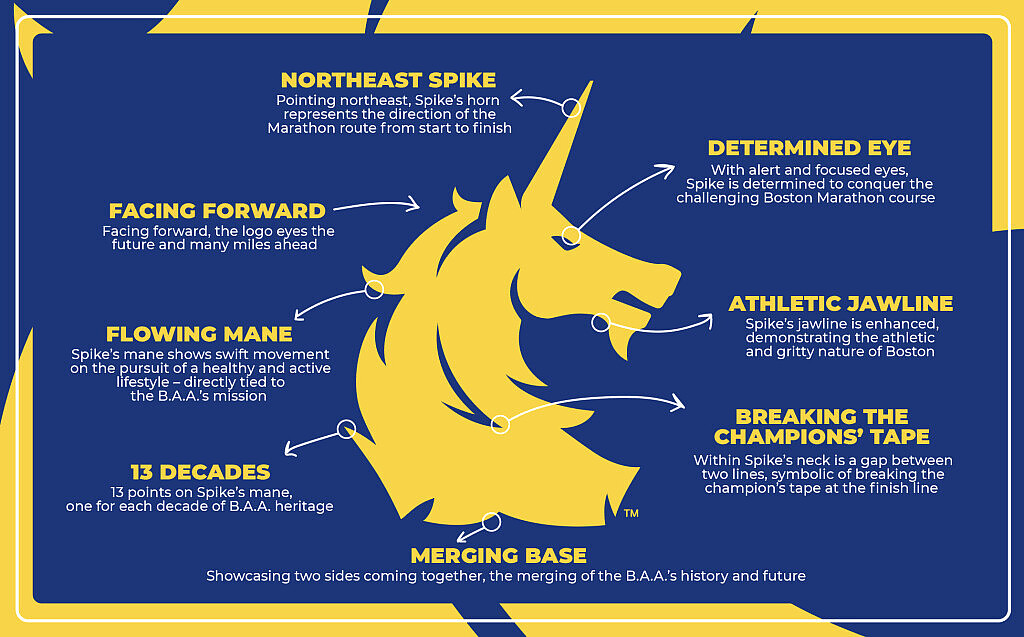
The most obvious change in Spike’s design is his orientation. Where the unicorn mascot used to look left, now he looks right. The B.A.A. calls this looking “forward,” pointing towards the miles ahead.
“We are looking forward, looking towards the future of the Boston Marathon, looking towards the future of running in general,” says Scott Stover, chief marketing officer at B.A.A. “Turning Spike around seemed natural as we were entering this next era.”
More controversial is Spike’s “athletic jawline,” which curves into the chin where it previously ran smooth. It creates the brief illusion of muscles—which the B.A.A. says represents the “athletic and gritty nature of Boston.” Coupled with a more “determined eye,” the unicorn may just be a fiercer version of his former self. Alex Cyr, a sports journalist covering marathons, finds this change laughable.
“The unicorn looks like it went from Pony[ta] to Rapidash,” Cyr says, referencing the Pokemon evolution. “You just see a unicorn that’s gotten a lot meaner.”
Stover contests the claim that Spike has gotten meaner, instead noting that they instituted these design changes to make Spike “serious and intentional.”
THE QUESTION OF CORPORATE BRANDING
Alongside the redesigned Spike, the new Boston Marathon logo also features a stamp of corporate marketing: the big “Bank of America” subtext, as well as the bank’s logo. While the fiercer appearance has some runners confused, the corporate branding has incited more anger.
Back in 1890, the Boston Athletic Association chose the mythical unicorn to be its symbol. Later named Spike, that unicorn saw several redesigns in the ensuing century, before eventually finding its way to prominent placement on the Boston Marathon medal. For years, Spike faced leftward, its horn jutting into the banner type of Boston Athletic Association (B.A.A.). Then in early June, Spike changed course.
The B.A.A. unveiled a new logo for the Boston Marathon, and people are not happy about it.
On its face, the redesign is small: Spike’s orientation is flipped, and he’s made a bit more menacing. The marathon logo, along with the new Spike, sports a fresh Bank of America sponsorship tag. Despite the small tweaks, the community response has been staggering: a recent Boston.com reader poll found 55% not liking the new logo, compared to just 14% loving it and 32% expressing indifference.
Why the backlash? The B.A.A. proves just how hard it is to stay fresh (and funded) while maintaining a sprawling, legacy-minded audience. Change, for some proud marathoners, is hard.
Alongside the redesigned Spike, the new Boston Marathon logo also features a stamp of corporate marketing: the big “Bank of America” subtext, as well as the bank’s logo. While the fiercer appearance has some runners confused, the corporate branding has incited more anger.
Just look at the Instagram comments under the announcement: “The big difference is adding Bank of America to the logo which clearly no one likes,” comments one marathoner. “Makes me less likely to bank with BoA,” comments another. Clearly, there is some ire for this emblazoned corporate sponsorship.
“Bank of America is invested in helping us continue to make the Boston Marathon and all of our events greater and greater every year,” Stover says. “So we’re proud of that partnership, and it is also very standard in sports marketing for brands to be included.”
This isn’t the first time the B.A.A. found themselves in hot water for the Bank of America branding. Back in April, the Boston Marathon debuted a new medal, featuring the bank’s logo on each and every medallion. The criticism was immediate.
Cyr was in Boston for the new medal’s premiere, and notes that there were “a few complaints.” He chalks this up to the race’s legacy: “[When] a race that’s been around for a long time, comes out with a rebrand, it is met with a bit of resistance by the traditionalists.”
The challenge that comes with rebranding an institution as beloved as the Boston Marathon is. balancing pride with progress. Marathoners complain of Spike’s fiercer look not because of any apparent flaw, but because they’ll have outdated tattoos. They complain of the Bank of America-themed logo not because they want to run the B.A.A. dry, but because they want to keep it pure. Eventually, the redesigned logo will become a piece of the Boston Marathon’s legacy; until then, the B.A.A. might have to endure some angry comments.
by henry Chandonnet
Login to leave a comment
Boston Marathon
Among the nation’s oldest athletic clubs, the B.A.A. was established in 1887, and, in 1896, more than half of the U.S. Olympic Team at the first modern games was composed of B.A.A. club members. The Olympic Games provided the inspiration for the first Boston Marathon, which culminated the B.A.A. Games on April 19, 1897. John J. McDermott emerged from a...
more...


