Running News Daily
Running News Daily is edited by Bob Anderson and team. Send your news items to bob@mybestruns.com Advertising opportunities available.
Index to Daily Posts · Sign Up For Updates · Run The World Feed
The Secret Psychology of Sneaker Colors
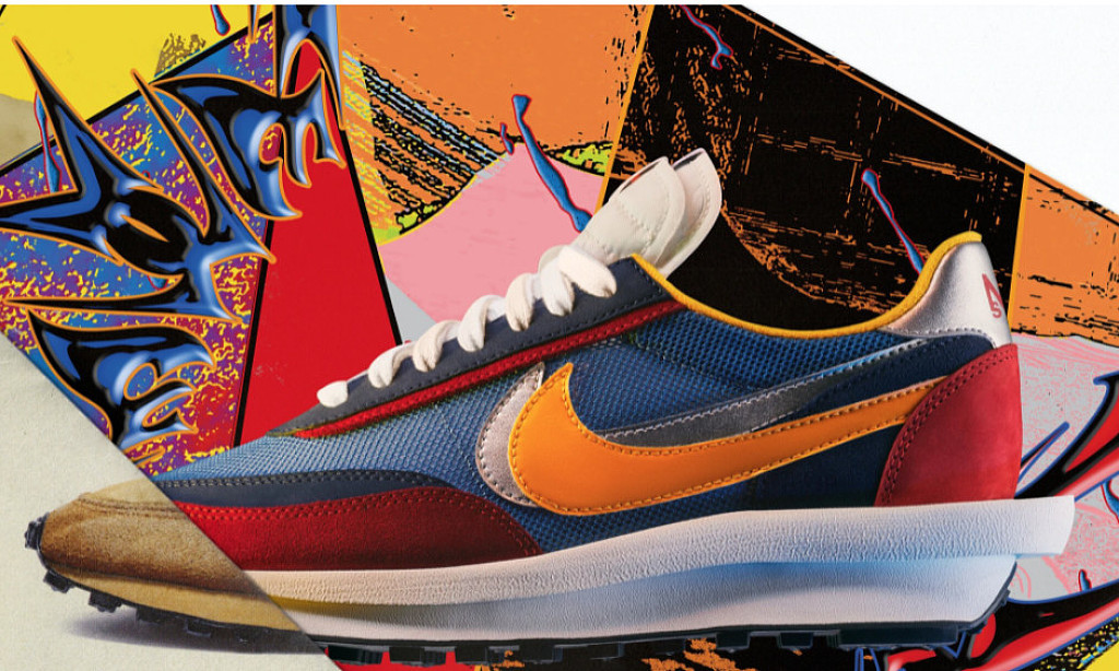
Aqua blue, acid lime and grape purple. Electric orange interspersed with neon pink. Gray suede and cheetah print mixed with white and gold. These are not descriptions of a minimalist’s worst nightmare, but rather new color combinations from Adidas, Reebok and New Balance. And they are jarring by design.
In the age of the infinite scroll and the era of sneaker culture, where the competition to make the hottest, rarest, most wanted kick is more intense than ever, the shoe that clashes shades with the most force stops traffic — at least of the online kind. As a result, athletic shoe companies are increasingly becoming fluent aficionados of that old art: color theory.


The links between color and emotion have been studied for centuries, from Carl Jung’s color coding of personality traits to focus groups evaluating the ways in which candy colors can affect perceptions of flavor. Drug companies color their pills “cool” or “hot” according to desired effect (hypnotics are often blue or green, antidepressants yellow), and we use SAD lamps in winter to replicate the energizing qualities of a sunny day.
Little wonder that sneaker brands have departments dedicated to manipulating minuscule shifts in shades, as well as engineering the visual equivalent of a crime scene so you rubberneck online. It’s their mission to create feelings and accelerate business.
“Between 70 percent to 90 percent of subconscious judgment on a product is made in a few seconds on color alone,” said Jenny Ross, the head of concept design and strategy for lifestyle footwear at New Balance. “It can excite or calm us, it can raise our blood pressure. It’s really powerful.”
So while the bread and butter of most brands remain the basics — the Nike Air Force 1 was the best-selling sneaker of 2020, and its default is all white — the pieces that power the continued churn and buzz are the limited-edition collectibles that tap into our subconscious to create desire.
Sometimes the triggers are obvious: The use of Varsity Red, for example, summons up Ferris Bueller collegiate nostalgia; gold and purple call to mind a Lakers game; and white is associated with racket sports. But in fashion, color is also your brand. Fendi is yellow, Hermès is orange and Tiffany is blue. Thus sneaker brands toggle between their core colors and wild experimentation.
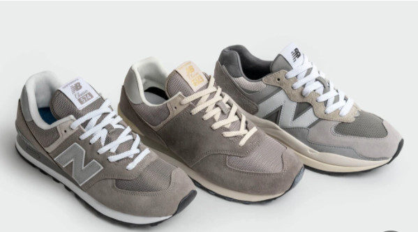
New Balance, for example, is rooted in gray, omnipresent every season, suggestive of the urban running shoe, riffing on concrete. “Doing gray right is something we take a lot of pride in,” Ms. Ross said. “Every gray on our color ring has a character and personality: Castle Rock is warm; Steel is a blue tone. With legacy models, we make sure our tanneries never stray. They replicate with precision.”
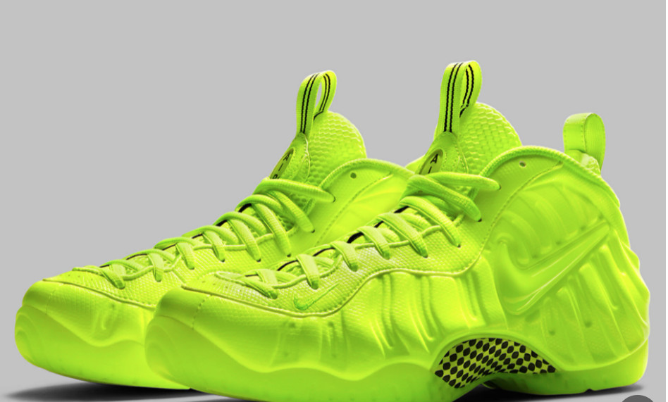
At the other end of the dial is Nike, with its neon lime Volt color, first seen at the 2012 Olympics. To some it is heinous, to others a masterstroke. “That was an intellectual and scientific choice for Nike,” said Bryan Cioffi, Reebok’s vice president for footwear design. “The first color you read in your optical receptors is that super-bright lime. It’s possibly an evolutionary take from poisonous animals and signals danger. A physical thing happens when you see it. Nike triangulated that and repeated it forever.”
Repetition is how you win the color game. You may see Volt and recoil, but you’ll always think “Nike.” As colors go, it is a paradigm for brand marketing. “We did a complete technology innovation study about how color showed up on HDTV and sports tracks,” said Martha Moore, a Nike vice president and creative director. “We were studying the idea of speed and what color complemented that in the vibration of the human eye. Volt is emotional.”
After a year of living our lives almost wholly online, pixel coloration has become even more key. “We are developing colors that appear lit from within,” Ms. Moore said. “Pixels sitting next to one another create previously unseen colors. They create new neutrals and complex combinations. We are using complex knits of yarns, with bright spots and glows that haven’t been seen before.”
Indeed. “We are seeing a particularly positive response to dialed up pastels and strong yellow,” said Heiko Desens, the global creative director of Puma. “Things that speak of energy and positivity.”
That new energy is everywhere. For example, the Yeezy Boost 700 Sun shoe, introduced in January, is a blaze of yellow and orange that is a world away from the beige associated with Yeezy of yore. Hardcore Rick Owens fans may own numerous black pairs of his Dunks, but the new season’s Geo Baskets in bubble gum pink throw a curve ball and flip the dark Owens aesthetic.
Login to leave a comment


